
User Experience (UX) is hard. Many UX designers work for years and years to hone their craft. If you don't have that kind of time and are looking for a few quick and easy user experience "wins" for your website, you've come to the right blog post. Here are some simple UX “no-nos” you should avoid to improve your website.
Don't Use "Read More" Links
Why? Because they don't tell anyone anything useful about the page you are linking to, especially screen readers and search engines. The text of a link should describe the thing it links to.
Instead: Use unique and descriptive text. For example, just use the title of the blog post in your blog listing. See? Easy!
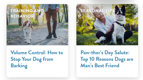
Not a 'read more' link in sight.
Unnecessary Animation
If I had a nickel for every time a designer was asked to add some "wow factor to a webpage with some animation,” I could buy the entire internet. Sometimes, animation just isn't necessary and you (the presumptive owner of the website) overthink how much your user cares about a nifty fade-in effect on a picture.
Don't get me wrong, animation can be a nice touch, but let's not put the cart before the horse. Animation should enhance the content or experience in a meaningful way or else it’s just distracting and annoying. Think of it like salt in a good meal – Too much and you ruin the whole thing.
Instead: Only use animation where it makes the content better.
The Order of Your Navigation Items Doesn't Match User Intent
In addition to keeping the total number of items in the navigation low, you also need to put them in the order your user cares about them. 99 percent of the time that means things like "Products" and "Services" at the beginning and "About us" or "Our tedious and boring company history" at the end (or not at all). If you aren't sure what your users care about, just ask them (or check your analytics and see the proof that only your CEO has ever looked at that interactive company timeline page).
Instead: Put the (actual) important stuff first, second, and third.
Pop-ups, Pop-overs, and Pop-unders (Just Stop)
I still don't understand how analytics and natural selection haven't weeded out these awful viruses of the internet. Whenever people ask us to use these invasive web species, the first thing we ask is "What do you do when you encounter these on other websites?" After about five seconds of silence, the answer is usually "You're right, never mind."
Instead: Just don't use these tactics. Ever.
Text in Images
I know you probably aren't a graphics professional so I'm going to cut you some slack. What if I told you text that you see in an image isn't real text? Yep. If you can't run your cursor over it and select individual words and letters, it is no more a piece of text than a picture of your dear Aunt Debbie. That means search engines and screen readers can't understand it (yet) and the image text can't resize and reflow properly for small, mobile screens. In turn, your users probably can’t read it easily either.
Instead: Don't just provide the text part inside of the image; provide a "real text" version of the content alongside the image.
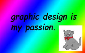
I love memes as much as the next guy, but this text is not machine readable. The text reads: "graphic design is my passion" in case you were wondering.
Low-contrast Text
Designers, I'm looking at you. This is almost always your fault. For some reason, designers LOVE very light, low-contrast text as a design element. The problem is, these designers use it in places where reading comprehension is critical to the user – and it's not just color that factors in to contrast ratios. Size matters too.
Image source – Nielsen Norman Group
Instead: Use a font size and color pairing that meets ADA contrast requirements. If you can't do this because the aesthetic is just too important to you, provide an accessibility tool like accessiBe so the user can override your styles.
Pre-checked Boxes in Forms
There's a word for this. It's called a dark pattern. Dark because if you pre-check a box in a form, you are almost always trying to trick the user into agreeing to something (like joining your mailing list). C'mon, if you have to trick users into signing up, they are not going to be real happy about it (I.E. a BAD USER EXPERIENCE).
Instead: Always make the user deliberately opt in or check the box on purpose. Let them decide fair and square.
"PDF-only" Content
My coworkers are sick of my endless "War on PDFs," but I will not stop fighting until every last one of them are defeated (the PDFs, not my coworkers). PDFs are NEVER a better user experience than regular old HTML content. They are terrible on mobile devices because they don't obey all that careful responsive web design we just built for you, and they are almost always a huge file that takes a long time to download.
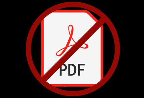
Instead: just take the time to turn them (the PDFs) back into web page content. It's worth it in SEO value alone. You can still offer a PDF if you have to, but always give users an HTML version first.
Need help implementing some of these ideas on your own website? Give us a call today to talk about your web design needs.