

Have you felt like the standard email metrics just aren’t cutting it for you? You’re not the only one. In fact, this feeling is what set us on a search to find or create a metric that could give us, and our partners, a better understanding of how healthy an email program is.
When thinking about email list health, or the health of one’s email program in general, the first metric many of us look at is our unsubscribe or opt-out rate. While this is a good starting point, and certainly worth keeping an eye on, opt-out rates alone cannot tell us the whole story.
We’re often asked what a “good” or “healthy” unsubscribe rate is, but there is no single answer to that question. No two email programs are the same and, if we get even more specific, no two email sends are the same, which makes it difficult to broadly define an unsubscribe rate that’s “healthy,” “good,” or “acceptable.”
These questions about list health and program health also come in the context of a specific campaign that underperformed or drew an above-average opt-out rate. We rarely get asked these questions when unsubscribe rates are steady, but steady doesn’t equal healthy.
So, to better demonstrate how individual email campaigns or marketing automation workflows are impacting the overall health of your email program, we’ve developed and implemented a new metric that provides a more comprehensive evaluation of email campaign performance and program health. And you won’t find this in your email platform’s dashboard.
Enter, “Risk”
No, not the board game of diplomacy, conflict, and conquest (but mostly conflict), we’re talking about Email Risk.
Risk, when calculated and applied appropriately, indicates whether a campaign, program, or automation is helping you achieve your goals or hurting the long-term health of your email marketing efforts. At its core, risk is a comparison of negative outcomes (unsubscribes, spam complaints, long-term disengaged contacts, etc.) to positive outcomes (opens, clicks, read time, conversions, etc.), which lets us see and evaluate the entire picture.
Why Risk Matters More Than Opt-Outs
We believe risk is superior to unsubscribe rate, as a measure of email list health, because the unsubscribe rates, on their own, cannot give you a clear indicator of whether a campaign was successful.
As we already mentioned, not all campaigns or lifecycle programs are created equally. It would be wrong to assume that every campaign with a high opt-out rate is cause for concern. Sometimes it’s in your best interest to occasionally run aggressive, sales-forward campaigns. These campaigns will undoubtedly turn away some subscribers but, if all else is in line, you may convert at an above-average rate while only turning away contacts who were unlikely to become customers.
On the flip side of the coin, your unsubscribe rates may be consistently below 2%—a relatively normal, healthy unsubscribe rate for many industries—but if no one’s reading, clicking, or converting, you might have some problems down the road.
How to Calculate Email Risk
We measure email risk, in its most basic iteration, by dividing the number of unsubscribes by the number of clicks for each individual email campaign.
Total Number of Opt-Outs / Unique Clicks = Risk
This is the most basic and broadly applicable version of this metric but, in a few moments, we’ll discuss ways you can tailor it to fit your specific program.
What Does Risk Tell Me?
Ultimately, risk tells you the necessary conversion rate to offset the value of your unsubscribed contacts.
For example, if you sent a promotional email that causes 200 people to click and 20 people to unsubscribe, the risk for that campaign would be .1 or 10%. So, for that campaign, you would need to convert 10% of contacts who clicked through to offset the lost value of the subscribers who opted out.
Really, it’s that simple?
Well, kind of.
Until now, we’ve been talking about risk in a world where a single conversion is equal to the lost lifetime value of a lost subscriber. But, in reality, we know it’s much more complex than that.
Very few of us are lucky enough to work with numbers that are that clear. Odds are, you’re likely dealing with any or many of the following things that complicate this formula:
- long sales cycles
- big-ticket conversions
- varying conversion values
- indirect attribution
- return buyers
- differing goals for each campaign
- etc.
In fact, I’d wager that more than one of those variables applies to most of you reading this, along with a slew of additional variables we didn’t mention.
So, let's dig even deeper and discuss how we can adjust this simple calculation of risk to better fit your unique circumstances.
Making Risk Work for You
While the simple formula we outlined above provides a useful foundation for evaluating your email program, it certainly is not perfect. To better tailor it for your program, consider different things that you could place on either side of the ledger.
If you’re concerned about sender reputation, you can factor in bounces and spam complaints on the negative side of the ledger. Or, if your business goals rely more on opens, read-time, or replies, you could factor any of those in on the positive side of the ledger as well.
It’s also worth considering the customer lifetime value or contact lifetime value when trying to determine the right inputs for your version of risk. Once you know the inputs that are most important to your business goals, factoring lifetime value into the equation is one of the most important things you can do to show, in dollars, how your email program is performing.
Visualizing Risk
Just like all email campaigns and marketing automation programs, not all risk is created equally. We can confidently say that risk scores under 2% are great while scores over 100% are likely to be problematic. But almost anywhere in between is going to require additional consideration.
We believe the best way to present this info about risk, especially when comparing multiple campaigns or programs, is to plot your results on a graph, like the one below! Doing so will help you better understand the differences in risk, in both degree and kind, and help you better communicate the impact of your email program on various business goals.
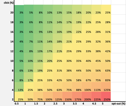
Looking at the graph above, we can clearly see the good in green and the bad in red, but what about all that yellow? Does 25% risk in the lower-left corner have the same business impact as 25% in the middle or the upper-right corner of the chart? No, and that’s why this visual aid is the final piece in the puzzle to understanding how your email program is actually performing.
Once you’ve calculated the risk for your various programs and campaigns, we recommend plotting them on a graph to see how they stack up. You’ll likely have a few instances where campaigns have similar risk scores but achieved them from very different levels of engagement.
Here’s an example of all one-off email campaigns that a business sent in the last six months. You can see that the campaigns in Group 1 were largely safe and effective, generating many more clicks than unsubscribes while those in Group 4 were rather risky, garnering significantly higher unsubscribe rates. But what about Group 2 and Group 3? The average risk between the two groups is similar, but they appear in dramatically different portions of our graph.
The difference between these two groups is impact. Group 3 appears to have had little impact, with both low opt-out rates and low click rates, while the campaigns in Group 2 had a significant impact, generating clicks and unsubscribes at an above-average rate.
These campaigns, the ones in the high-impact and low-impact regions of your graph, need some extra attention to truly understand how they are supporting or hurting your business goals. They are also ripe for optimization work, as a few small tweaks could bring down high unsubscribe rates or bump up low click rates.
Ultimately, plotting campaigns allows us to break up and examine campaign risk in the following ways:
- Least Risky (High Click, Low Opt-Out)
- High Impact (High Click, High Opt-Out)
- Low Impact (Low Click, Low Opt-Out)
- Very Risky (Low Click, High Opt-Out)
Now What?
If you’re a math whiz and already have ideas on how to construct and weigh your email risk model, good for you! If not, no worries, we plan to do a deeper dive in the future to outline how different businesses can apply the concepts and variables above to get an accurate measure of risk for their business.
Meanwhile, you can play around with the basic formula for risk to see how well it fits your program and what additional variables could improve it. Consider the following…
- Which campaigns are working and which aren’t?
- What stands out about the campaigns with the highest and lowest risk score?
- Are some of your “riskiest” campaigns also your most successful, or vice-versa?
- Which campaigns and programs seem to have the highest or lowest impact?
Ready to work with an agency that understands the complexities of your email program and knows how to take it to the next level? Fill out the form below and let us know how we can help you reach your goals.