Aztek Web Team
Our focus is on growth: growing website results and, ultimately, growing business through strategic website design, development, and digital marketing.
Grouping related information into a single container can be extremely useful on the web and off. Card-based design takes this simple idea and strategically applies it to the web, and particularly to mobile design.

We’ve understood for a long time that grouping related information into a single container can be extremely useful on the web and off. Card-based design takes this simple idea and strategically applies it to the web, and particularly to mobile design (where space, grouping, and information relationships are most valuable to users).
Card-based interfaces have the ability to easily stack, either across or down, on multiple size screens making them indispensable in today’s responsive environment. Popularized by sites like Pinterest, Dribble, Facebook, and Spotify; their influence has spread quickly. But don’t dismiss this as a mere trend. Card-based design offers an experience that highlights single, digestible elements that can be perfect for web content. As the web moves away from the static page toward more personalized experiences (with aggregated content), card-based design offers a winning creative pattern to work with.
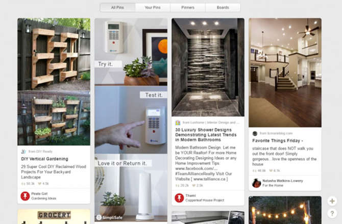
Pinterest was one of the first to use a card-based design to showcase its user’s pins. Image via Pinterest.com
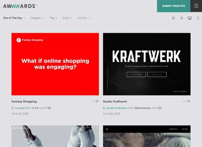
Awwwards.com features a portfolio of websites in card tile fashion.
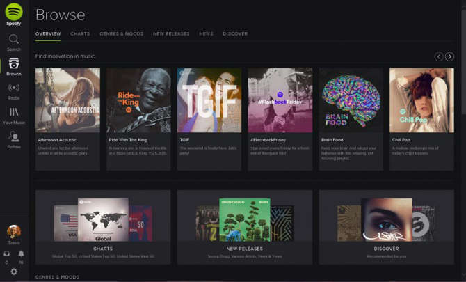
Spotify uses a grid-based card design to showcase its music offerings.
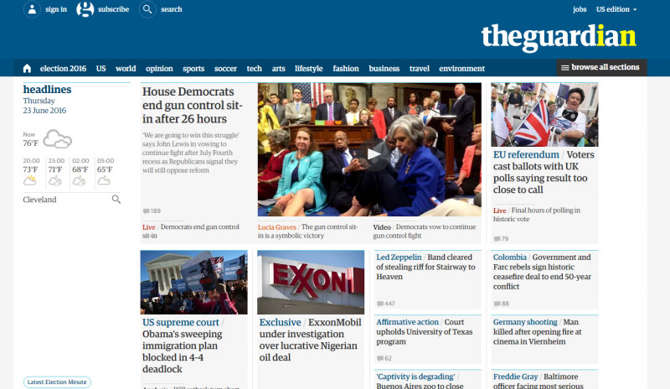
The Guardian uses card-based news snippets to highlight the large amount of data it produces daily.
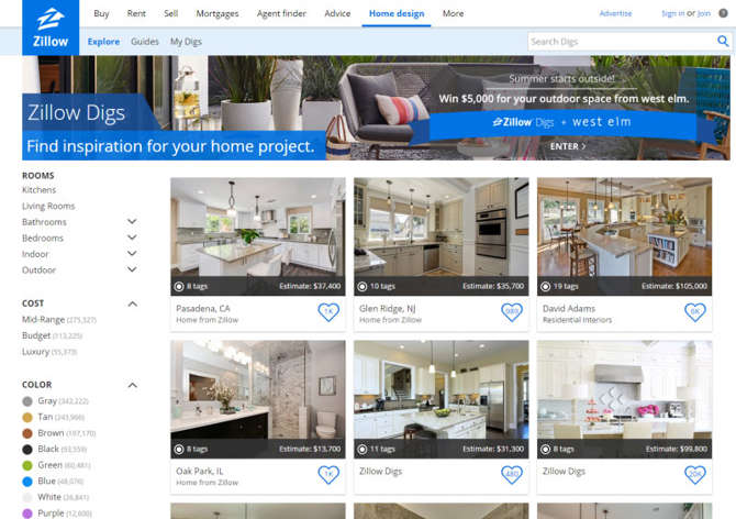
Zillow, a real estate offering site, makes it easy for users to quickly look through cards for each of their listings.
Interested in learning more about web design patterns that can help you communicate more effectively with your users? Aztek is consistently looking for the best way to design great experiences on the web. Get in touch with us today to learn more.
Photo Credit: "The heat is on!" by marco is licensed under CC BY 2.0
Our focus is on growth: growing website results and, ultimately, growing business through strategic website design, development, and digital marketing.